admin
No description.Please update your profile.
Deep-dive review: Windows 10 — worth the wait
Microsoft makes up for Windows 8 by delivering a truly integrated operating system.
Finally, an operating system from Microsoft you can love.
With Windows 10, Microsoft undoes the damage wrought by Windows 8. This is a cleanly designed operating system that works equally well on traditional computers and tablets, brings back the much-mourned Start menu and introduces useful features such as the Cortana digital assistant and new Edge browser.
I’ve been following the progress of Windows 10 ever since the first technical preview last year, and wrote about the second technical preview back in January 2015. I lived with, tested and reviewed its major iterations. I’ve seen rough edges smoothed, new features introduced and some features dropped.
ALSO ON NETWORK WORLD: What if Windows went open source tomorrow?
This shipping version (which will be officially available on July 29) is much improved over the last time I reviewed it in late May. Since then, the overall interface and Start menu has been tweaked, Edge has been completed and bugs have been squashed. It’s now a more complete and refined operating system. (Note: A separate version for smaller mobile devices is expected to be released in the fall.)
That’s not to say that all is perfect. In this review, I’ll give an in-depth look at the new operating system, including its best and worst features. Read on for the complete rundown.
Starting with the Start menu
In Windows 10, everything starts with the new Start menu. Tap the Windows key to launch it; tap it again to make it disappear. The Start menu is command central for the entire operating system, displaying live tiles with changing information from Windows 10 apps, letting you launch all your apps, giving you access to your settings and to File Explorer, and letting you shut down and restart Windows.
And note — there’s been yet another name change. Microsoft has a new designation for the touch-screen apps once called Metro and then called Modern: They are now simply Windows apps. Applications written for use with a keyboard are called desktop apps.
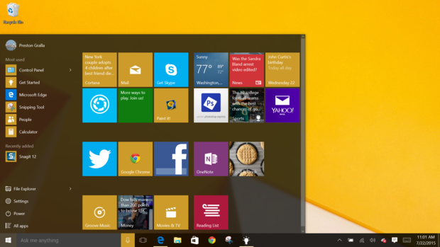
Windows 10 start menu
In Windows 10, everything starts with the new Start menu.
If you use Windows 10 on a non-touch desktop or laptop PC, you thankfully never need to see the touch-oriented tablet mode (what Microsoft called the Start screen in Windows 8) — you boot right into the desktop. The Start menu and desktop is all you need and all you get. For me, this alone makes the new operating system a winner.
The left side of the Start menu has links to your most used programs, recently added programs, File Explorer, Settings and Power, along with a link that leads to a list of all the apps on your computer. At the top left of the menu is an icon that shows you which user account you’re currently using and takes you to a menu that lets you switch accounts, log out of your account or go to the Lock screen.
Eye-candy fans (such as me) will appreciate that the Start menu is transparent. It’s also customizable. You can change the menu’s height (but not its width) by pulling down the double-headed arrow that appears at the top when you move your cursor over it and dragging it to make it the menu taller or shorter. Oddly enough, a double-headed arrow appears when you put your cursor on the right side of the menu, implying you can change its width, but I wasn’t able to drag the arrow to do that.
There’s a lot more you can do to customize the Start menu. You can group related applications and then name them — for example, you might want to put the Groove Music, Movies & TV and Xbox apps into a group that you call Entertainment. You can also pin and unpin apps to and from the Start menu and Taskbar, and resize the tiles by right clicking on them. Depending on the app’s capabilities, you might also be able to turn a live tile off so that it’s static instead of displaying changing information. (I found this a surprisingly useful feature. With too many tiles flashing at me, I felt at times as if I was in a Vegas casino.)
Right-clicking also lets you uninstall apps. Some Microsoft apps, though, can’t be uninstalled, including the Movies & TV, Calendar and Groove Music apps. They can, however, be unpinned from the Start menu; if you want to run them later, you can type their name into Cortana.
The upshot? The Windows 10 Start menu is more than just a redone version of its Windows 7 predecessor. With it, you run both Windows 10 apps and desktop apps, which goes a long way towards making Windows 10 feel like a truly integrated operating system.
Continuum and tablet mode
Also helping to unify the operating system is a new feature called Continuum, which lets Windows 10 perform a shape-shifting trick by detecting the type of machine you’re running, and then changing its interface to the one suited for the device. It’s particularly useful for two-in-one devices such as the Microsoft Surface Pro, which works as a tablet or laptop, depending upon whether you have a keyboard attached.
And the OS will change dynamically. If you’re using the tablet with a keyboard attached, you see the desktop-based interface, complete with Start menu. Detach the keyboard and you get a pop-up notification that asks if you want to switch to tablet mode. If you don’t want to be bothered by the notification again, you can select “Remember my response and don’t ask again.” From then on, you’ll switch automatically from desktop to tablet mode and back again.
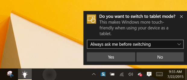
Windows 10 continuum
A new feature called Continuum lets Windows 10 detect the type of machine you’re running and switch the interface to suit the device.
Continuum worked for me without a hitch, switching every time I unplugged a keyboard from my Surface tablet, or plugged the keyboard back in.
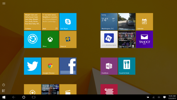
Tablet mode offers much the same Start screen interface that many Windows 8 users, including me, have come to hate: Big tiles representing the apps you want to run. It’s ideal for tablets, though. And although most of the changes Microsoft has made in Windows 10 have to do with the desktop, the company has also made some improvements to the tablet interface.
Gone is Windows 8’s kludgy Charms bar with links for sharing, settings, devices, moving to the Start screen and searching. Of all those links, the only truly useful one was for searching — and in Windows 10, you search in tablet mode by tapping the Cortana search button at the bottom left of the screen. (For more about Cortana, head to the next section of this article.)
I won’t miss the Charms bar. I think that few people will.
Windows 10 tablet mode
Tablet mode offers much the same Start screen interface that came with Windows 8, although with improvements.
There have been other changes as well. There’s now what some people call a “hamburger menu” at the top left of the screen — three horizontal stacked lines. In a way, it’s a mini-Start menu for tablets: Tap it and you get a menu that lists your most-used and most recently added apps; it also contains links to File Explorer, Settings, the Power button and all your apps.
I’m a big fan. There’s no longer any need to scroll and hunt through the Start screen for apps I frequently run. Instead, they’re easily available from the menu. And you can run desktop apps from this menu, not just Windows apps. It’s one more way in which Windows 10 now works as a unified operating system.
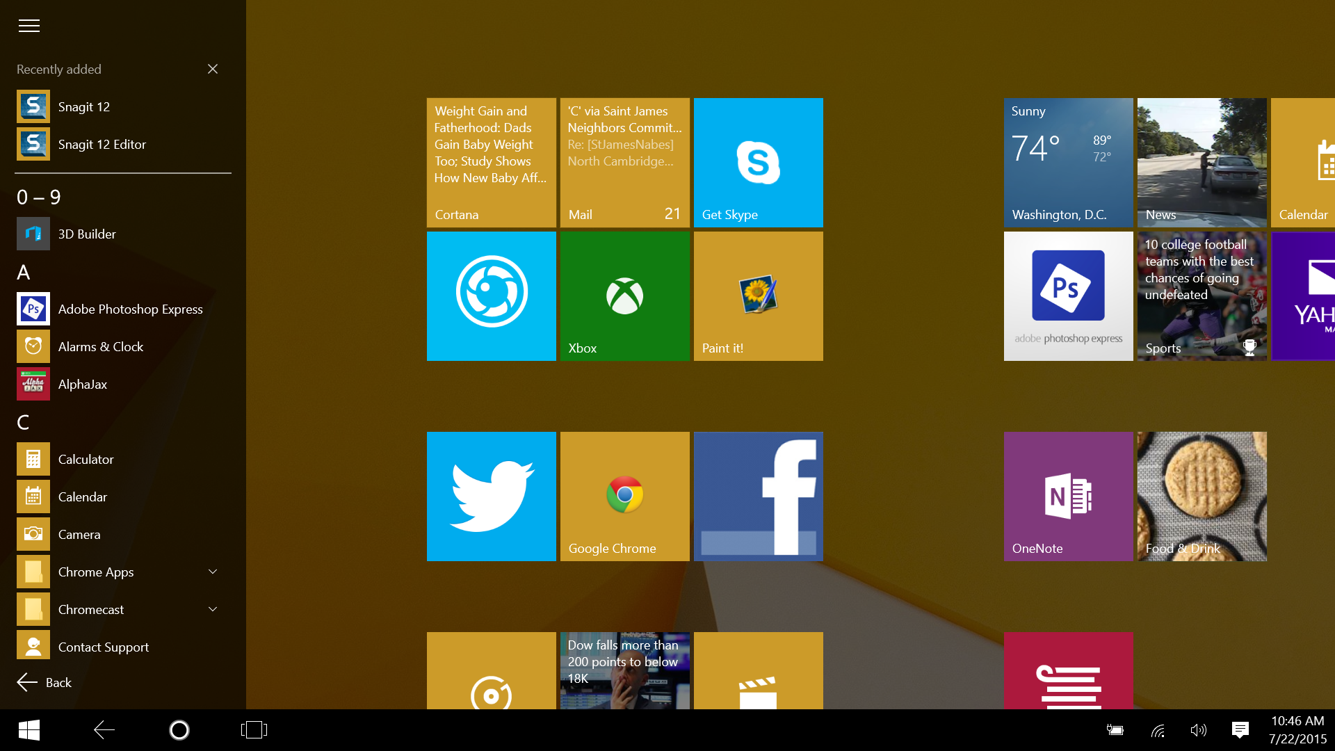
Windows 10 all apps
A “mini-Start menu” for tablets lists your most-used apps, your most recently added apps and links to useful system tools.
At the bottom left of the Start screen there’s another menu icon that looks like a bulleted list. Tap it to see a list of all of your apps, including desktop apps and built-in Windows apps such as Settings.
Also new is that the Taskbar runs at the bottom of the screen in tablet mode — the same Taskbar that is on the desktop. Although I risk sounding like a broken record, it’s one more way that Windows 10 feels like a single interface spanning two modes, rather than two operating systems uneasily joined together.
Cortana
I’m not much of a fan of iPhone’s Siri digital assistant or Google’s Google Now — I tried them briefly and found them only moderately helpful. They sometimes felt more like parlor tricks than practical features I could use throughout the day. So I didn’t think I’d be happy with Cortana.
I was wrong. Cortana is more than a mildly useful appendage to Windows 10. It’s embedded deeply into the operating system. The more you use it, the more useful it becomes, because it learns about you over time. Not that it’s perfect, because it makes errors along the way and there are some important things it can’t do.
Windows 10 cortana
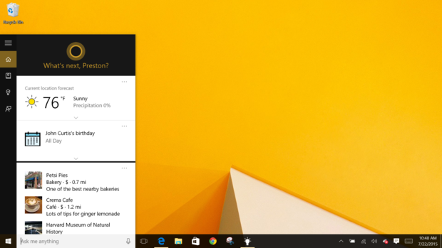
The Cortana digital assistant is present primarily as a search bar under the Start menu.
Cortana is present primarily as a search bar under the Start menu; you can also launch it by tapping its tile on the Start menu. (In tablet mode, it’s accessible from an icon on the Taskbar). You wake it up by saying “Hey Cortana” or “Hi Cortana.” You can then ask it to do something, such as find a file, launch a program or find information. If you prefer typing to talking, type your request into the search bar.
What you’ll see next depends upon your request. Cortana, which is based on Bing’s search engine, looks through your files, your Microsoft OneDrive cloud storage account, your videos and music, the apps on your PC, your settings, your email and the Web. The actions it takes or the way it shows your search results varies according to what you’ve asked for.
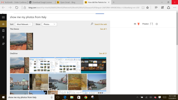
For example, when I said, “Show me my photos from Italy,” Cortana quickly found them on both my PC and on OneDrive — and displayed them. At the top of the results, I could click a link to search for photos of Italy on the Web.
When I asked, “What’s the weather?” it knew my location and told me it was 74 degrees and sunny, and also displayed the weather forecast. And when I said, “Add an appointment on Sunday,” it asked me what time the appointment was scheduled to start, and from there I was able to quickly add an appointment to my calendar.
Windows 10 Cortana photos
The search results after a request to Cortana to see photos from a trip to Italy.
There are limits to Cortana’s capabilities, though. I use Gmail as my primary email account, and Cortana wasn’t able to reach into it to search through messages. In fact, it wouldn’t even launch Gmail for me. Instead, it did a Bing search for Gmail and showed me a page of search results on the Web. If Cortana is going to become a truly useful digital assistant, Microsoft will have to figure out a way for Cortana to interact with all the major Web-based apps.
I will say this for Cortana, though — it’s a fast learner. When I said “Launch Google Chrome,” it asked whether I wanted to launch Google Chrome or Chrome App Launcher. I told it to launch Google Chrome. Every time after that, when I made that same request, it launched Google Chrome without asking for clarification.
When Cortana runs, it displays a menu made up of a group of four icons stacked underneath a “hamburger” menu on the left side of the screen, which are both somewhat useful and somewhat confusing. The top one, Home, simply navigates you to the main Cortana interface. Beneath it, the strangely-named Notebook icon leads you to a tool to change Cortana’s settings — such as whether you want to get recommendations about places to eat or events to attend; what your home, work and other “favorite locations” are; how to change the name Cortana uses for you; and so on.
Beneath Notebook, the Reminders icon does exactly what it says — lets you set reminders, which can be triggered by a time or a location you visit. And the bottommost icon, Feedback, lets you provide feedback about Cortana.
Cortana is tied to your Microsoft ID, so it has the same information about you on all the Windows devices you use, including smartphones.
Overall, Cortana is still a work in progress. It does an excellent job of reaching into your PC; searching the Web; knowing your location, likes and dislikes; and delivering you information based on that. But until it can also reach into Web-based apps like Gmail, Cortana can never be a complete digital assistant.
Gaining an Edge
Another big addition to Windows is the new Edge browser, which replaces the justifiably maligned Internet Explorer. Edge is Windows 10’s default browser and with it, Microsoft hopes to eventually bid farewell to IE.
Microsoft can’t entirely get rid of Internet Explorer yet, though, especially because enterprises have built apps based on it. So you’ll still find it in Windows 10. But unless you have to run it for compatibility reasons, don’t — because Edge is a considerable improvement.
With Edge, Microsoft focused on creating a speedy browser — and the work has paid off. I found that it displayed Web pages extremely quickly, much faster than Internet Explorer, and equal to or possibly faster than Chrome.
To check my impression, I ran three browser speed tests using Edge, Internet Explorer and Chrome. I ran each test three times for each browser and averaged the results. Edge scored faster than Internet Explorer in all three tests and faster than Chrome in the SunSpider and Kraken tests, while losing to Chrome in the Octane test.
Windows 10 Edge browser: Test results
But even though Edge is speedy, you may encounter rendering problems with some Web pages. It won’t run Google Inbox, for example. And when I ran the HTML5 test, which tests for compatibility with HTML5 standards, it lagged behind Chrome, scoring 402 out of a possible 555 points, compared to 526 for Chrome. Internet Explorer did even worse than Edge, with a score of 348.
Edge takes much of its inspiration from Chrome, dispensing with as many menus and extraneous design elements as possible. For example, it has jettisoned Internet Explorer’s oversized back and forward buttons, so that the content of a Web page stands out more. Edge will also support add-ins, but that feature is not yet available, and will be included at some time later.

Windows 10 edge
The Edge browser will eventually replace Internet Explorer.
The browser’s basics are straightforward — there are several icons to the right of the Address Bar that offer access to a variety of features.
To begin with, you click on a star to add a favorite. A menu icon just to the star’s right lets you to browse favorites, view downloaded files, see your history list and use the browser’s reading list feature (more on that in a bit).
Another icon lets you share a URL via Mail, Twitter, OneNote and the reading list. And over on the far right there are three small dots that, when clicked, bring up other features such as zooming, launching a new window, printing, pinning the current site to the Start screen, opening a new “InPrivate” window for anonymous browsing, and launching the current page in Internet Explorer.
There is an icon to the left of the star that resembles a book and activates Edge’s Reading View, which is much like a similar Safari feature: It strips out everything extraneous to a page’s content, including ads, navigation, sidebars and anything else that diverts attention from the content. You read the text in a scrollable window, with graphics included. The icon will be grayed out if you’re on a page that Reading View can’t handle, such as a page that is primarily used for navigation.
As for the reading list, it’s a list of your Reading View favorites. So when you’re in Reading View, click the star icon for adding favorites and the current page gets added to your reading list.
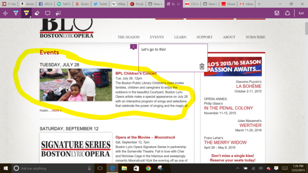
Edge also offers the ability to annotate and share Web pages. Click the annotation icon (to the right of the menu icon — it looks like a pencil and paper) and you’ll be able to mark up a Web page using highlighters and note-creation tools, save the annotated page and share it as a .jpg graphics file via email, OneNote or Twitter. You can also save the annotations to your PC via Microsoft OneNote. I personally found that feature less than useful; others may differ.
Widnows 10 Edge markup
Edge includes the ability to annotate Web pages.
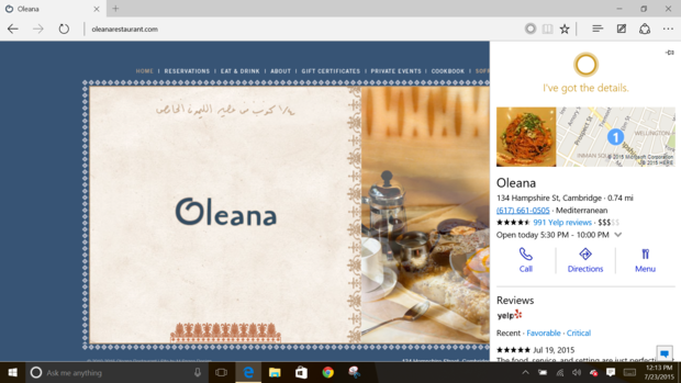
On the other hand, one of Edge’s most useful features is the way in which it takes advantage of Cortana, which inconspicuously appears at the top of pages for which Cortana can offer help. For example, when I went to the Web page of one of my favorite restaurants, the Cortana icon appeared to the right of the Address Bar with the message, “I’ve got directions, hours, and more.” When I clicked it, a sidebar appeared on the right-hand side of the page with a map, address, phone number, description of the restaurant and reviews. There were also links for getting directions, looking at the menu and calling the restaurant.
For me, this is the biggest edge that Edge has over competing browsers. It doesn’t just display specific Web pages, but it can also deliver useful information not found on that page.
Windows 10 cortana helps edge
Edge doesn’t just display specific Web pages, but can deliver additional useful information not found on the page.
My verdict on Edge? Given its speed, Reading View, Cortana integration, simple design and eventual ability to use add-ins, it’s a winner. For now, it may not render all Web pages correctly, but I expect that will be fixed eventually. When that happens, I may abandon Chrome for it.
Windows Apps on the desktop
One reason Windows 8.1 felt like two separate operating systems was the dramatically different behavior of the apps that were written for the touch interface (now called Windows apps, remember?) and those written for the non-touch desktop. Desktop apps could be run in resizable windows, but Windows apps ran either full-screen, “snapped” next to another Windows app (but not a desktop app), or minimized. So you couldn’t have multiple Windows apps running in separate windows on the desktop alongside desktop apps.
That changes in Windows 10. Windows apps can now be resized, minimized and closed in the same familiar way as desktop apps. You can drag the edges of a Windows app to resize it and use the familiar desktop menu on the upper right for minimizing, maximizing and closing the app.
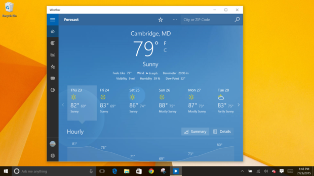
Windows 10 apps
The apps in the Windows touch interface can now be resized the same way that desktop apps can.
Windows apps have been redesigned in another way as well. On the left-hand side of the screen is a series of icons for accessing different features in an app. These icons change depending on the app. For example, the Weather app has icons for news, maps, historical weather and so on. And in the news app there are icons for local news and videos, and for customizing your news interests.
Another improvement: Windows apps in version 8 were low-powered and not particularly useful — more like simple tablet apps than fully featured desktop apps. In Windows 10, that changes. Some are quite good. You may even find yourself wanting to run them.
Three apps in particular have been powered up: Maps, Mail and Calendar. Mail has been notably improved with a new interface and new features. Unlike the Mail app in Windows 8, it supports POP-based mail. It’s also much simpler to manage your mail in it. When reading an email, icons across the top let you reply, forward, delete, archive and flag mail. You can click the menu at the upper right to get at more features, including moving mail, marking it as read, printing and zooming.
Text-formatting features are also better than in the Windows 8 version. When you compose mail, a large toolbar appears at the top of the screen, which lets you change text formatting; undo and redo text changes; insert tables, pictures and links; and attach files. You can also spell check your mail and change its language.
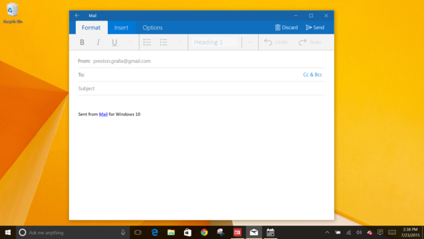
Windows 10 mail
The Mail app’s text formatting features have been greatly improved.
Tablet users will be pleased to know that gestures work in the Mail app. Swipe an email to the right to archive it and swipe again from the right to unarchive it. Swipe to the left to flag a message.
The Calendar app is also much improved. I found the Windows 8 version so cluttered and confused-looking it felt unusable. If you wanted to do something simple like change the view (Day, Work Week or Month) it wasn’t clear at first how to do it. You had to call up a menu, and then make your choice.
In the Windows 10 version, the Day, Work Week, Week, Month and Today views are all accessible by clicking an icon at the top of the page. I also appreciate that even when looking at a day’s calendar, the month view is available on the right side of the screen.
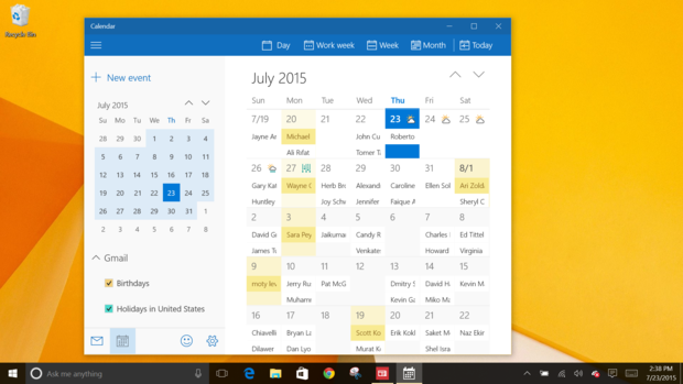
Windows 10 calendar
The new Calendar apps has a much cleaner interface than the previous Windows 8 version.
As with Mail, improvements are more than skin deep. Notably, unlike in the Windows 8.1 version, the new Calendar supports Google Calendar. Just click Setting / Accounts / Add Account, click Google and follow the instructions on-screen. You can add an iCloud calendar in the same way.
Maps is also improved. Travelers who use tablets or laptops will appreciate that you can download maps and use them when you’re not connected to the Internet. This is especially useful if you’re travelling overseas and want to keep down your data use, or if you know you’re going to be somewhere beyond the reach of an Internet connection.
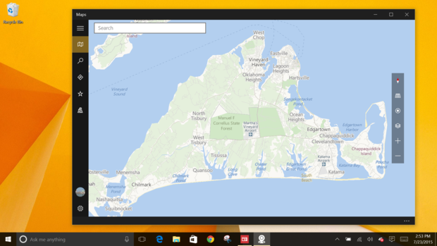
Windows 10 maps
The app is much better designed than previously. Icons down the left let you search for a location or for places such as hotels, restaurants and coffee shops; add a location to a favorites list; get directions for driving, walking or for public transportation; change your settings; and visit what Microsoft calls 3D cities. Go to one of these 3D cities and you’ll see a view of it similar to Google Earth. I didn’t find them particularly useful, but you can’t beat the feature if you want to virtually visit Aix en Provence, Paris or Barcelona. (I passed on Brownsville, Tex. and Abington, Penn.)
On the right side of the Maps app you’ll find buttons for zooming in and out, tilting the map, changing its orientation and adding overlays for traffic and other tools.
One piece of big news is that the app now has a Street View-like feature called Streetside, which works much like the Bing Maps Streetside feature. With the addition of Streetside, the Maps app could give Google Maps a run for its money. It has much the same features and integrates well with Cortana. For example, if I tell Cortana, “Give me directions to Ithaca, New York,” the Map app launches, complete with directions. If I ask Cortana to see a map of a city, Maps launches to it.
One Settings app to rule them all
In Windows 8.1, if you wanted to change your settings, you had to go on a treasure hunt. Some settings were in the Windows Settings app, which was accessible via the Charms bar, while others were in Control Panel. It was difficult to remember where each setting was located.
In Windows 10, you’ll find almost all settings in the Settings app, accessible from the bottom of the Start menu. It’s cleanly and logically organized, with nine sections: System, Devices, Network & Internet, Personalization, Accounts, Time & Language, Ease of Access, Privacy and Update & Security. Click on the icon for any section, drill down, and you’ll easily navigate to what you need. There’s also a search bar so that you can forgo browsing and search for a specific setting instead.
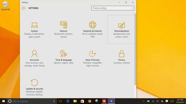
People who do a great deal of customization and tinkering (including me) won’t find everything they need in Settings. If you want to assign your PC a static IP address, have your system display files that are normally hidden, display file extensions for common files or access a host of other techie settings, you’ll have to go to the old standby, Control Panel. On the other hand, having settings that you don’t use much relegated to the Control Panel makes sense, because it makes the main Settings app easier to navigate.
Hello, Action Center
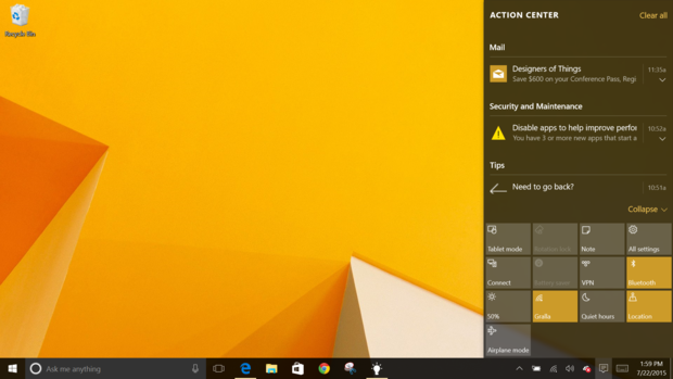
New in Windows 10 is the Action Center, which is accessible via an icon on the right side of the Taskbar. The Action Center performs two functions: It displays notifications for such things as new emails and security and maintenance messages, and it gives you access to a handful of common settings for such tasks as connecting to Wi-Fi networks, turning Bluetooth on and off, and changing brightness settings. The notifications for new email, security alerts and others first appear on their own on the lower right of the desktop and disappear after a few seconds. But they live on in the Action Center, so that you can attend to them there when you want.
For example, if you tap an email notification, the email opens in the Mail app. Tap a security notification, and you’ll be taken to the appropriate tool. When I received a notification that I could speed up my PC because three unnecessary programs were launching on startup, I was sent to the Task Manager, which let me stop those programs from running.
Windows 10 action center
The Action Center displays notifications and offers access to commonly-used settings.
At the bottom of the Action Center are icons for making quick changes to common Windows settings. You can turn Bluetooth on and off, change your screen’s brightness, and switch between tablet mode and non-tablet mode, among other settings.
Other changes
There have been a lot of other lesser changes in Windows 10. The Taskbar now runs on the Start screen when you’re in tablet mode, which helps to unify the tablet and non-tablet interfaces. It’s now black, which makes the icons on it stand out more clearly.
File Explorer has seen changes as well. Its icons are more colorful and brighter. You can pin and unpin folders to it on the Start menu. You also get to OneDrive from inside File Explorer; it appears as a folder with subfolders underneath it. And you can share files — click a file and select Share from the top menu and you get a variety of ways for sharing, including via email and Twitter. You can compress a file and burn it to disc from the same menu.
The Windows Store has also gotten a makeover. The design is simpler, cleaner, even elegant. More important than that, though, is that you can now download and install desktop apps from it, something not previously possible. Microsoft is also making a push to get more apps into the store by introducing what it calls Universal apps that will be able to run on any Windows device, including desktops, laptops, tablets and phones.
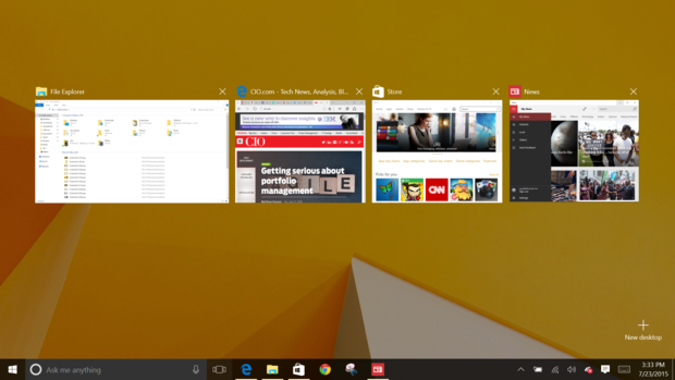
Also new is Task View and the ability to create multiple desktops. Tap the small icon just to the right of the Cortana search bar and you’ll see all of your currently running apps and applications as thumbnails on the desktop. Click the X on any of the thumbnails to close it.
More importantly, though, you can create multiple desktops, each with different apps and applications running on them. To do that, when you’re in Task View, you click New desktop to create a second desktop; you can then run apps and applications inside it. In fact, you can create several desktops; to switch among them, click the Task View icon, and then click the desktop you want to switch to.
Windows 10 task view running
Task View shows all of your currently running apps.
If you’ve got the proper hardware, Windows 10 supports a biometric security feature that Microsoft calls Windows Hello, letting you log into Windows via a fingerprint scan, face scan or iris scan.
Not everything about Windows 10 is an improvement over Windows 8, though. Whether you like it or not, Windows 10 updates are always automatically installed. In Windows 8 you could pick and choose which updates to install. Not so with Windows 10. What Microsoft sends via Windows Updates gets installed. Case closed.
The bottom line
It’s this simple: Windows 10 is a dramatic improvement over Windows 8. It works as single, unified operating system rather than a Rube Goldberg kludge of two operating systems poorly bolted together. It changes its interface depending on whether you’re on a tablet or a traditional PC, and runs well on both.
Cortana, despite some shortcomings, is a very worthwhile addition, and the Edge browser gives Chrome a run for its money. Built-in apps are greatly improved.
Despite some bugs and annoyances (like being forced to accept Windows updates), it will be worthwhile to upgrade from Windows 8.1 before July 29, 2016, when Microsoft’s one-year free upgrade offer runs out. Windows 7 users should consider upgrading as well, thanks to Cortana, Edge and the advent of useful Windows apps. (That said, you do have that full year to upgrade, and there are compelling reasons to wait a little while.)
As for me, I’m upgrading every Windows device I have to it.
Best Microsoft MCTS Certification, Microsoft MCITP Training at certkingdom.com
No description.Please update your profile.
You must be logged in to post a comment
@ 2016 Certkingdom.com-Developed By Certkingdom.com